We’re excited to share a redesign of our file viewer that makes it simpler and more intuitive. Based on best practices and customer feedback, we’ve made significant improvements to improve your review and approval process. Here’s what’s new:
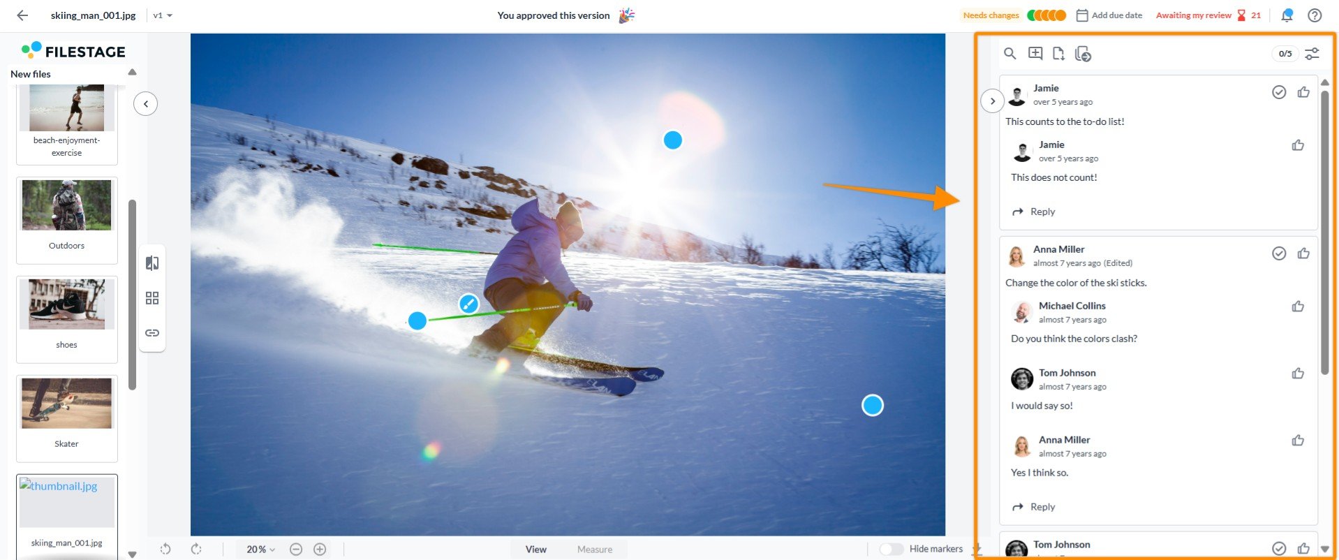
Following industry best practices, comments have moved to the right side to create a more intuitive layout.
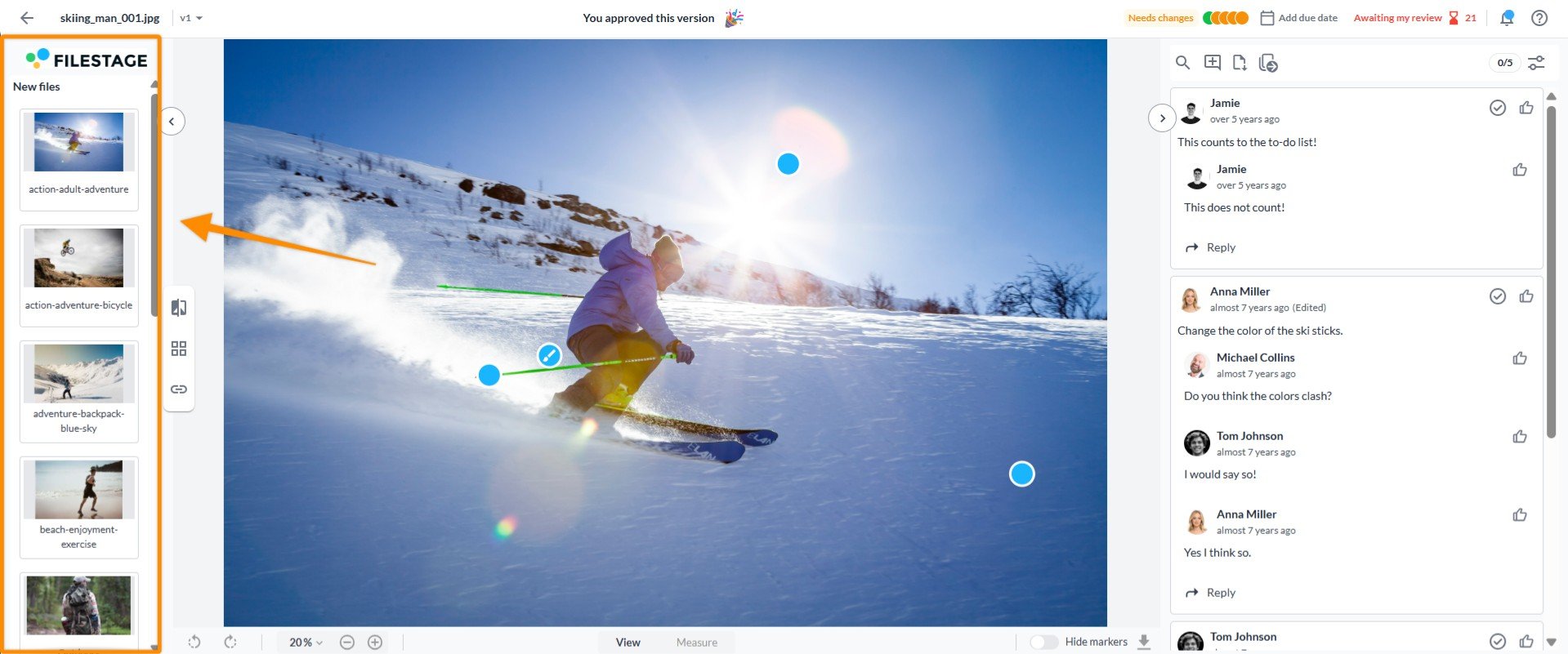
The gallery is on the left, collapsible, and open by default for guest reviewers, ensuring no files are overlooked.
Shift + O: Open or close the file gallery.
Shift + Arrow Up/Down: Quickly navigate to the previous or next file, even if the gallery is collapsed.
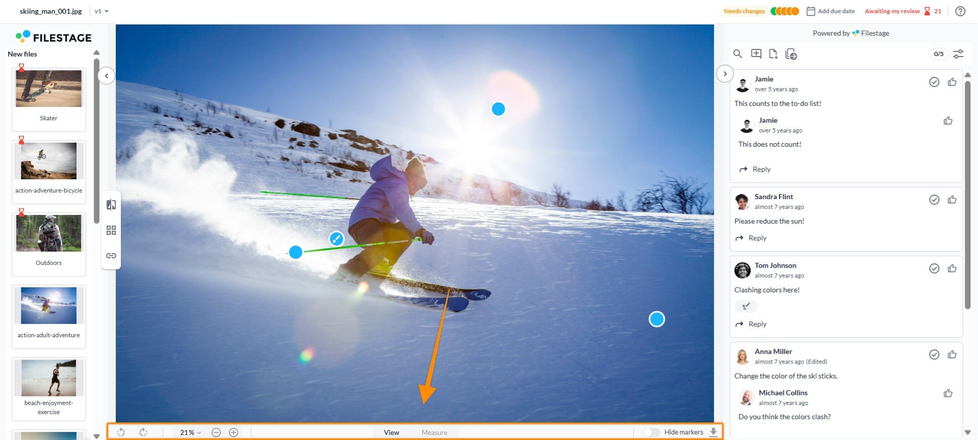
We've combined two navigation bars into one for a more focused experience.
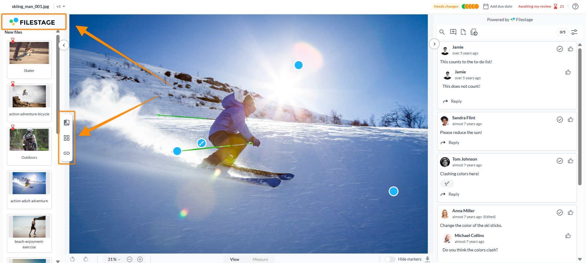
The logo is now at the top of the file gallery, and key tools like compare view, grid view, and file links are in a floating toolbar for easy access.
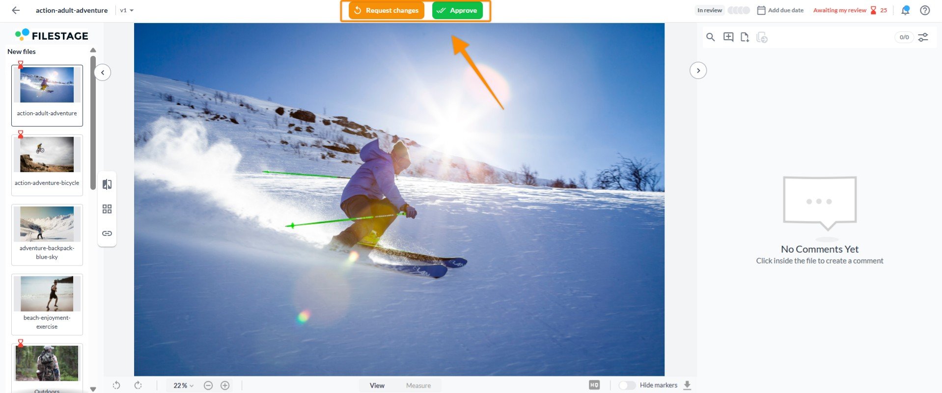
The review decision button has a fresh look and is now positioned at the top center for better visibility.
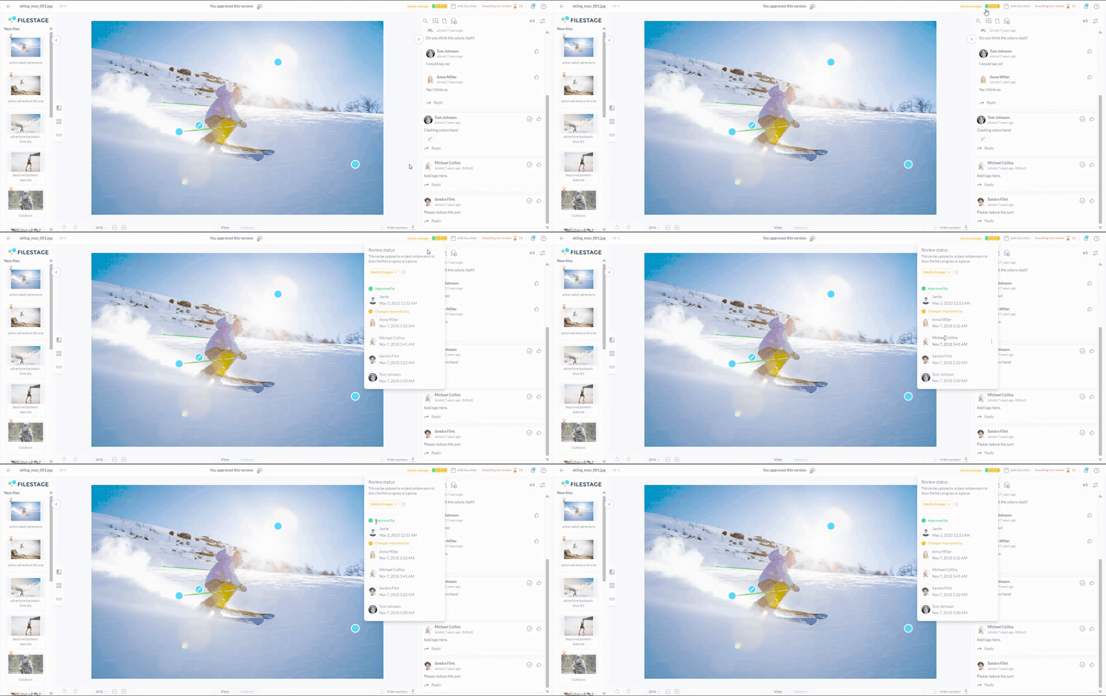
We’ve refined the review status button and modal to streamline the process.
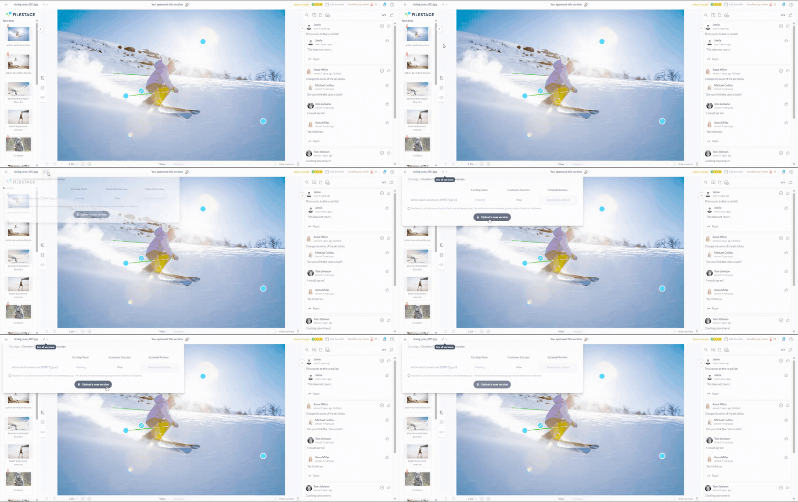
The "Upload version" button is now located in the versions modal for a more intuitive workflow.
You can see the new file viewer in action right now in your account, or check out this video to explore all the updates:
We hope these changes make your workflow smoother and file reviewing easier. If you have any questions, feel free to reach out to our support team!
Let us know if you have any questions by reaching out to us on chat or emailing us at support@filestage.io. We're always happy to help!